Illustrator Tutorial: Paper Cut Out


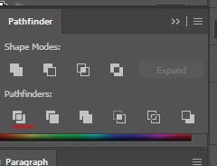
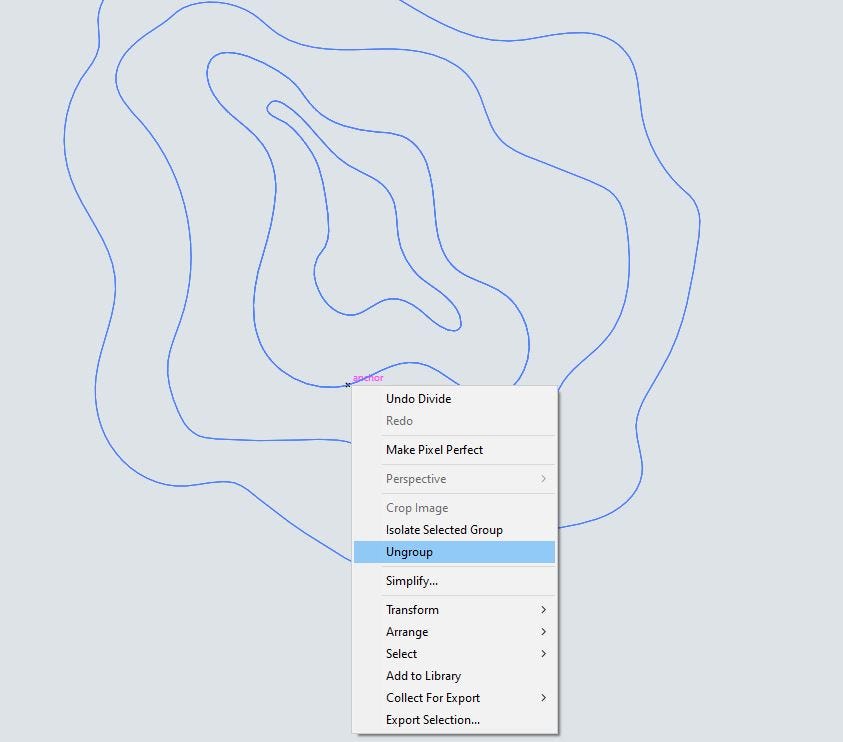
To start off this paper cut out style, I made a blank canvas, then made a light greyish blue background. I then made several wave lines, using the selected them all, used the pathfinder tool (divide) and ungroup the shape.
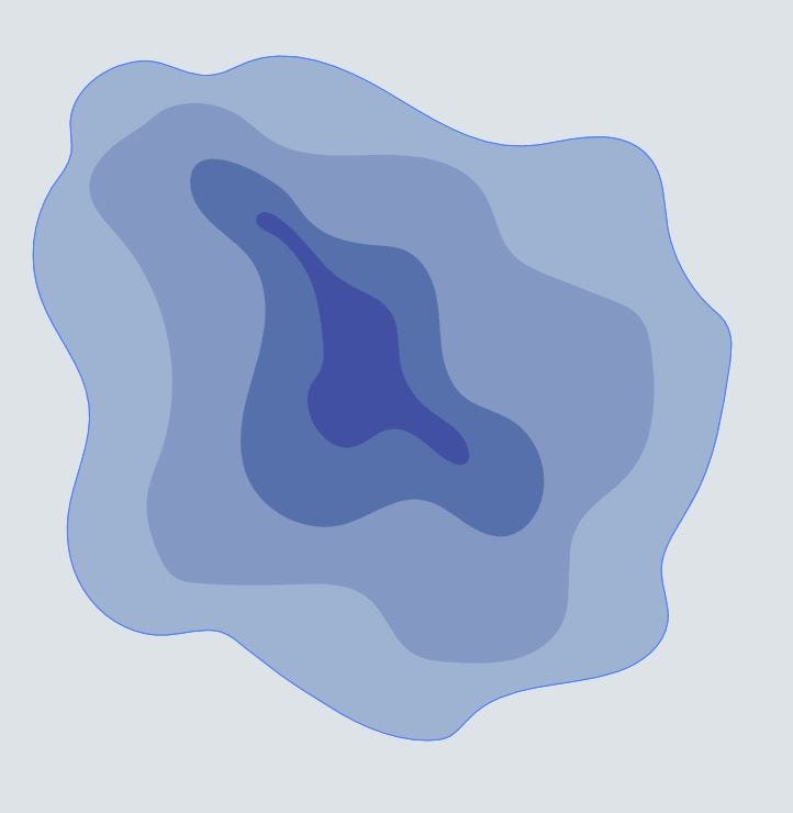
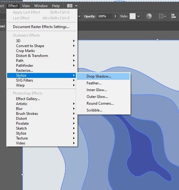
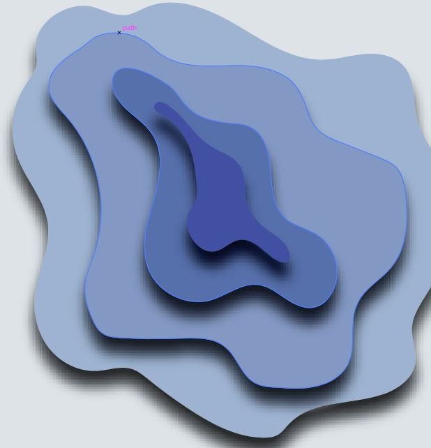
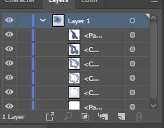

All are the shapes are filled with blue, but are different shades and tones, going more saturated (not too saturated) and deeper, the more centred it becomes. To get that paper cut effect, drop shadows need to be applied to them all, and once you’re happy with how they look, apply. Because of the older they were drawn in, they need to be rearranged; go into the layer they were drawn on, switch them around so that the lighter tones are at the top and the dark tones are sunk at the bottom.
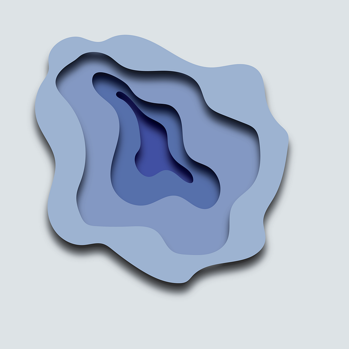
It has been a very fun tutorial on how to make things very paper like, and this can be taken much further in the future.
Illi Tutorials. (2019, November 14). Quick Paper Cutout Effect — Adobe Illustrator Tutorial. Retrieved March 19, 2021, from Youtube: https://www.youtube.com/watch?v=9RMzmZKf7w4


